
Designing an Election Map That Reflects Voting Patterns
Election maps play a crucial role in visually representing voting patterns and outcomes. They provide valuable insights into how votes are distributed geographically and help us understand the political landscape of a region. Creating an election map that accurately reflects voting patterns requires careful consideration of various factors such as data accuracy, visualization techniques, and audience engagement. In this article, we will explore the key elements to consider when designing an election map that effectively communicates voting patterns.
Understanding the Data
The first step in designing an election map that accurately reflects voting patterns is to understand the data. It is essential to have access to reliable and up-to-date election results to create a meaningful representation of voting behavior. Make sure to gather data at the most granular level possible, such as precincts or districts, to capture the nuances of voting patterns within a region. Additionally, consider incorporating demographic data, such as age, gender, and ethnicity, to provide a more comprehensive view of voting trends.
Choosing the Right Visualization Technique
Selecting the appropriate visualization technique is crucial in designing an election map that effectively communicates voting patterns. Different visualization methods, such as choropleth maps, dot density maps, and cartograms, offer unique ways to represent data. Choropleth maps, for instance, use color gradients to show voting percentages in different areas, while dot density maps use dots to represent individual votes. Experiment with different visualization techniques to determine which method best highlights the voting patterns you want to emphasize.
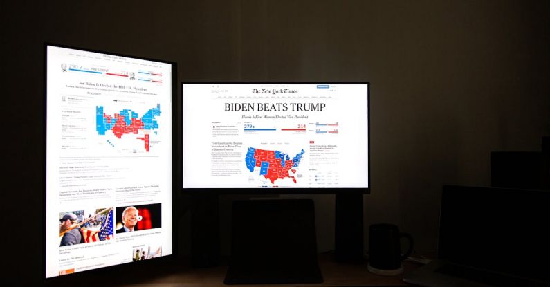
Color Coding and Legend
Color coding is a powerful tool in designing an election map that reflects voting patterns. Choose a color scheme that is intuitive and easy to interpret, such as using red for Republican-leaning areas and blue for Democratic-leaning areas. Ensure that the color gradient is consistent and accurately reflects the distribution of votes across the map. Including a legend that explains the color scheme and scale is essential for helping viewers understand the meaning behind the colors used in the map.
Highlighting Key Insights
To make your election map more engaging and informative, consider highlighting key insights and trends in the voting patterns. Use annotations, labels, and callout boxes to draw attention to significant findings, such as swing districts, landslide victories, or demographic shifts. By adding context and narrative to the map, you can help viewers make sense of the data and understand the implications of the voting patterns observed.
Interactive Features
Incorporating interactive features into your election map can enhance viewer engagement and provide a more immersive experience. Consider adding zoom, pan, and filter options that allow users to explore the data at different levels of detail. Interactive maps enable viewers to interact with the data, compare different regions, and uncover hidden patterns that may not be immediately apparent in a static map. By incorporating interactive features, you can make your election map more dynamic and compelling for a wider audience.
Conclusion: Crafting a Compelling Election Map
Designing an election map that effectively reflects voting patterns requires a thoughtful approach that considers data accuracy, visualization techniques, color coding, key insights, and interactive features. By understanding the data, choosing the right visualization technique, and highlighting key insights, you can create a compelling election map that informs and engages viewers. Whether you are analyzing election results, predicting future outcomes, or simply exploring voting behavior, a well-designed election map can provide valuable insights into the political landscape of a region. Experiment with different design elements, be creative in your approach, and strive to create a map that not only informs but also captivates its audience.